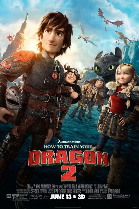
There are very few sequels that manage to outdo their predecessors. Aliens, Empire Strikes Back and The Godfather: Part II are amongst the handful that do. But get ready to add writer-director Dean DeBlois’ How To Drain Your Dragon 2 to that list. Taking place five years after Hiccup (Jay Baruchel) and Toothless united dragons and Vikings, this second chapter of the planned trilogy spotlights the pair struggling with the realities of adulthood in the far off land of Berk. When their hillside hamlet is threatened by a band of dragon trappers led by villainous Drago (Djimon Hounsou), the dynamic duo must get everyone to reunite for peace – only it’s not going to be easy. Thrilling, bold, breathtaking and all around brilliant, this iteration surpasses the already amazing original.
Since we had such a great experience at the immersive press day held on the Dreamworks campus, we wanted to share with you a few behind-the-scenes details we learned about the film.
How To Drain Your Dragon 2 is unlike anything you’ve ever seen before. Yes, I know that sounds like hyperbole, but it’s true! This film utilizes cutting edge technology called “Apollo,” which not only changes the game on rendering time, but also let’s animators add tiny, more human nuances to their animated creations. It truly is astounding what the animators have been able to do with this new software. DeBlois says, “It allows the animators to just follow their intuition. They now work like stop-motion animators working with a puppet, pushing around the clay, making a key frame and moving on. It allows them to go back into it and refine it. They have so many more controls under the skin than they used to have; our models are much more complex. It makes time for them to go back and really finesse.”
The sequel skews a tad darker than its predecessor – and to brilliant effect. DeBlois states, “I try to make the movie that I want to see or that I would have liked to have seen when I was 10 and that I would love to see now. For me, The Empire Strikes Back was the ultimate one. Not only is it the best sequel I can think of, but it spoke to such a broad audience. And I think that’s what we’re doing here. We’re trying to make like a true four-quadrant movie that speaks to the adults as much as the youngsters. I always feel like it’s a bit of a mistake to consider it just a children’s movie. The nice thing is that by meeting Hiccup as a 20-year-old, it’s a different problem. It’s like another stage of his life. He’s kind of on that threshold of youth and adulthood and wondering where he really fits into it all, not feeling like he’s a carbon copy of his father. And he has a journey of discovery to go on. It’s nice to be able to age our characters.”
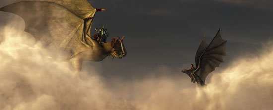
The first battle sequence in How To Drain Your Dragon 2 is the biggest ever in animation history. Says head of layout Gil Zimmerman, “We couldn’t have done this scene on the show if the creative leadership wasn’t in sync together and if we didn’t have the technology we had. If you look at some of the shots in pre-vis [pre-visualization], they represent not only the lighting but animating dragons is really hard. We also had crowds all the way back there. What was complex with crowds for this shot was normally in animation you have got a thousand guys in the stands yelling ‘hurray!’ In this one, you’ve got guys with weapons, doing behaviors, other ones operating other weapons and contributing to the scene. It took months and months to render this shot. I wanted to have a shot we’ve never done in animation.”
Cate Blanchett’s character Valka was inspired by Marlene Dietrich. Says art director Pierre-Olivier Vincent (or “POV,” as everyone calls him), “When we started we didn’t know at the time that Cate Blanchett would be the voice, but we knew that we needed somebody with incredible features and strong charisma. When Dean was pitching me the character, I instantly had a face come into my mind, which is Marlene Dietrich. And then, we learned that Cate Blanchett was doing the voice. So, it’s very funny the way things come on the show.”
It took animators four years to create Hiccup’s look. As many of you know, animation is a long, arduous process. In the case of the first film in the ongoing saga of Hiccup and Toothless, it took creators four years to find the right character design for Hiccup. In the early stages of the first film, designers didn’t really know what they’d be working with and he looked more like a freckle-faced, Archie-inspired kid. “It could be very cartoony, very comedic, funny and stylized, or maybe a bit more naturalistic,” says POV. He continues, “Very quickly, we realized that this is a growing up story; this is a story of this adolescent that has to make big choices in his life. He had to be more like a teen, and maybe not like too cute, small.” It wasn’t until many iterations later, after all their questions had been asked, did they finally find their Hiccup. “We kept like exploring, changing sometimes technique, and completely different direction. And one of the artists came up with this one. We said, ‘Wow! Okay, now we have somebody.’ to get to this point, it took four years, four years of a lot of worrying, not only on the Hiccup, actually on all the characters.”
Award-winning cinematographer Roger Deakins is the film’s visual consultant. There’s been a recent trend in animation where filmmakers hire live-action cinematographers to help bring a richer, deeper aesthetic to their pictures. Deakins, who began his consulting career on Pixar’s WALL-E, returns to the franchise again on this film working closely with director DeBlois and head of layout Zimmerman. Zimmerman states, “He would come in every other week and do dailies. I would show him either storyboard sequences – stuff we hadn’t shot yet, picture concepts – and also works in progress – portions of scenes. Luckily, there wasn’t much we had to change because I have the same sort of aesthetic he has and also he taught me some things on the first movie. We would start thinking about lighting from day one. What you see here in pre-vis would be stuff we had in our minds from discussions with Dean, POV, myself and Roger.”
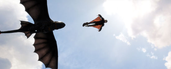
Hiccup’s wingsuit sequence inspired animators to go skydiving. For many jobs, being a daredevil isn’t usually a pre-requisite – except when it comes to being an animator on How To Drain Your Dragon 2. Head of character effects Oliver “Olee” Finkelde – one of the film’s few animators who actually jumped out of an airplane to get the sensation – says, “We really wanted to audience to feel like they’re flying with them through the sky. When we did our research, we kind of figured out that we should actually learn how to fly a wing suit. From character effect’s side, we wanted to know how you actually fly a wing suit and what’s your body position? How do you move in it? And so, working with animation was great because we kind of had to teach the animators you know how do you flip on your back, how do you fly straight, how do you turn? For that, it was very helpful.”
Hiccup’s dragon blade will be the toy of the summer. Or so bets Dreamworks CEO Jeffrey Katzenberg. DeBlois says, “Jeffrey Katzenberg wanted some sort of iconic weapon for Hiccup. But the thing is Hiccup’s a pacifist. So, it was this task of how we adorn him with something that’s kind of cool you know, but has a purpose that’s customized to Hiccup. The idea was Hiccup being schooled as a blacksmith’s apprentice by Gobber. He has sort of a modern sense of thinking – he’s like a little Da’Vinci living in Berk. So, his curiosity of dragons led to this tool, which he carries with him. In an effort to help dragons see him as a dragon himself, Hiccup created this tool to harness the power of dragon fire, so that he could produce it. I sort of designed it as a toy in mind.”
HOW TO TRAIN YOUR DRAGON 2 opens on June 13 and is rated PG.
Courtney Howard is the Senior Editor/ LA Correspondent for VeryAware.com. She also is a contributing writer for ReelVixen.com and SassyMamaInLA.com. She resides in Southern California with her husband and perfect little dachshund.
* Courtney attended a press event courtesy of Dreamworks. The review is in our own words and is our opinion.

